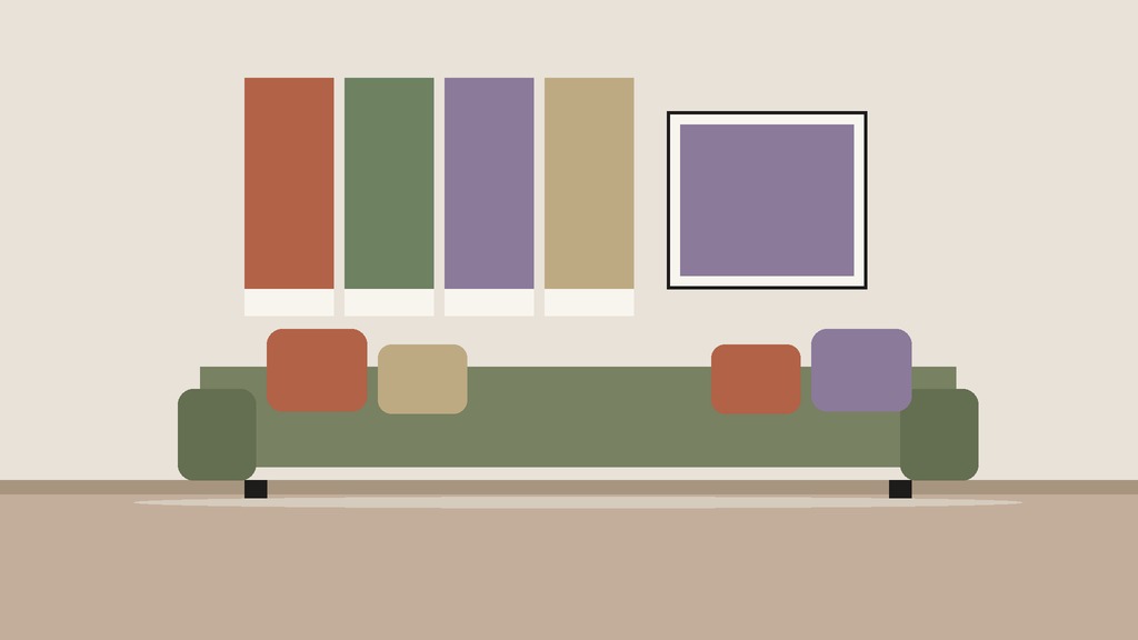
Rust, olive and deep plum look like three different moods until you put them in one room. Rust brings heat, olive brings calm and plum brings depth, and together they make the kind of living room that seems built for lamplight and long evenings. They are also hard colours to use badly if you follow a few rules about proportion, undertone and light.
This guide to a fall colour palette for the living room explains how to pick and test the three colours, where to put each one, and how to combine them with neutrals, wood and metal. The method works for any warm, rich palette, so you can swap in your own versions of the three colours.
Why these three colours
They work for a reason: all three are muted, earthy and slightly warm, so they sit together without clashing.
- Rust is a red-orange with brown in it. It reads as warmth, and it pairs naturally with wood.
- Olive is a yellow-green with grey in it. It acts as a calm, natural neutral.
- Deep plum is a purple with brown or red in it. It is the darkest, so it supplies depth and drama.
All three can be found in nature in November: leaves, moss and berries. That is one reason the combination feels easy.
Step one: look at the room you have
Before choosing a colour, note what is fixed.
- Walls: are they warm white, cool white, grey, beige or a colour?
- Floor: is the wood yellow, red, grey or dark?
- Large furniture: the sofa, the rug and the curtains, which are the hardest to change.
- Light: which direction do the windows face, and how bright is the room?
A north-facing room gets cool, steady light, which can make colours look greyer and flatter. A south-facing room gets warmer, brighter light, which brings out the red in rust and the yellow in olive. Colours change through the day, so check them in the morning, at noon and in the evening with the lamps on.
Step two: use proportions
A simple rule keeps a palette balanced.
- The 60 part: the main colour. Usually a neutral or a quiet shade, covering walls, the large rug and the sofa.
- The 30 part: the secondary colour. A colour that supports the main one, in curtains, an armchair or a large piece of art.
- The 10 part: the accent. The boldest colour, in small amounts: pillows, a vase, a throw or a lamp.
Here is how the three colours might fit.
Three palette recipes
Recipe one: olive leads
- Main (60): a warm cream or oatmeal on the walls and a neutral sofa.
- Secondary (30): olive, in curtains, a chair or a large piece of art.
- Accent (10): rust cushions and a plum throw.
This is the calmest version, and it suits a small or north-facing room.
Recipe two: plum leads
- Main (60): a deep plum wall or a plum sofa with warm white trim.
- Secondary (30): olive curtains or a large olive rug.
- Accent (10): rust in pillows, a ceramic vase and a lamp base.
This is the most dramatic version, and it suits a room with good light.
Recipe three: rust leads
- Main (60): a neutral room with a rust sofa or armchair.
- Secondary (30): olive in a rug or curtains.
- Accent (10): plum in cushions, a throw and a small picture.
This is the warmest version, and it suits a living room with dark wood.
Step three: test before you commit
Colour is the one decorating decision that is easy to get wrong on a screen.
- Collect samples: paint chips, fabric swatches, a cushion or a piece of paper.
- Put them in the room, next to the sofa, floor and curtains.
- Look at them at different times, with natural light and with lamps on.
- Take a photo and view it away from the room.
- Wait a day, and see if you still like it.
For a wall, use a large sample board or a painted patch of at least 30 centimetres on two walls. Do not judge from a small chip.
Where each colour goes
- Walls: olive and plum are the bolder choices. A single plum wall, behind the sofa or the bookshelf, adds depth without taking over.
- Rug: a rug is a good way to bring a colour into a room without paint. A rug with all three colours in a faded pattern is the easiest anchor.
- Sofa and chairs: a neutral sofa with accent chairs in rust or olive gives flexibility.
- Curtains: olive or plum curtains in a heavy fabric frame a window and add warmth.
- Pillows and throws: the easiest and least costly place to test a colour.
- Art and objects: a framed print, ceramics and books bring in the three colours at small scale.
Fabrics that carry the palette
Colour changes with fabric, so choose textures as carefully as shades.
- Velvet deepens plum and makes it look richer, because the pile catches light.
- Linen and cotton soften olive and keep it from looking heavy.
- Wool and bouclé add warmth to rust and read as cozier under lamplight.
- Corduroy gives a flat colour some depth, and works for a chair or cushion.
- Leather, in tan or cognac, acts as a fourth warm tone beside the rust.
Keep a swatch of each fabric next to your wall colour. Fabrics often look different from the sample on a website.
Mistakes that make a palette look off
- All three colours at full strength. Let one colour lead, and keep the other two quieter.
- Cool whites with warm colours. A bluish white wall makes rust look orange and olive look muddy. Choose a warm white.
- No contrast. If everything is mid-tone, the room feels flat. Add something dark and something light.
- Matching everything. A rug that matches the curtains that match the sofa looks like a set from a catalogue. Vary the shade and the texture.
- Ignoring the floor. A rug is the largest piece of colour you can add, so choose it early.
Neutrals, wood and metal
The three colours need a background.
- Neutrals: cream, oatmeal, warm grey and charcoal. They calm the palette and give the eye a place to rest.
- Wood: warm woods, such as oak, walnut and teak, suit the palette. They carry some of the rust tone.
- Metal: brass, copper and aged bronze bring warmth. Black metal gives contrast.
- Greenery: a plant adds fresh green that is different from olive, so choose a real plant over a fake one if you can.
If you are mixing wood tones, keep a few of the same undertone and let one stand out as the main.
Light and mood
Rich colours need good lighting.
- Choose warm bulbs in lamps, since cool bulbs make rust look flat and plum look dull.
- Use lamps at different heights, not just the overhead light.
- Add a mirror opposite a window to bounce light.
- Use candles in flameless form on shelves and tables, and real ones only if you are present and they are clear of fabric.
Renters and small spaces
If you cannot paint:
- Use textiles: curtains, rugs, throws and cushions carry most of the colour.
- Use art: a large framed piece with the three colours acts as a palette guide.
- Use leaning mirrors and shelves for colour without holes.
- Use a plum or olive sofa cover, if the sofa itself is a different colour.
Less or More: the palette plan
| Less | More | |
|---|---|---|
| Colours | Rust and olive | Rust, olive and plum |
| Where | Cushions and one throw | Rug, curtains, chairs and art |
| Walls | Leave as they are | Paint one wall |
| Time | An hour | A weekend |
| Watch out for | Looking pale | Too many strong colours at once |
A worksheet for the choosing
If you want a place to build the palette on paper, the Maximalist Home Styling Playbook from Green Velvet includes a colour story section built on the 60/30/10 rule, with a colour worksheet and a pattern mixing page.
Knowing when it works
You will know when the palette works because every colour appears at least twice in the room and no colour takes more than it should. More colour-led rooms are collected on the Maximalism hub. See also our guides to fall shelf decor with collections you already own, small space fall decor ideas and fall candle decor.
Free checklist: Less or More?
Not sure which lane fits your room or closet? Our free 2-page printable walks you through a one-hour room reset and a weekend closet sort, with a Less column, a More column and a stop rule for each. We will email it to you, free.


Leave a Reply